
For each of the paintings, Sophia and Olivia looked at the image for five minutes. Then they closed the book and tried to remember details about the painting that stood out for them.
Below are the paintings the girls studied and their comments about each one.
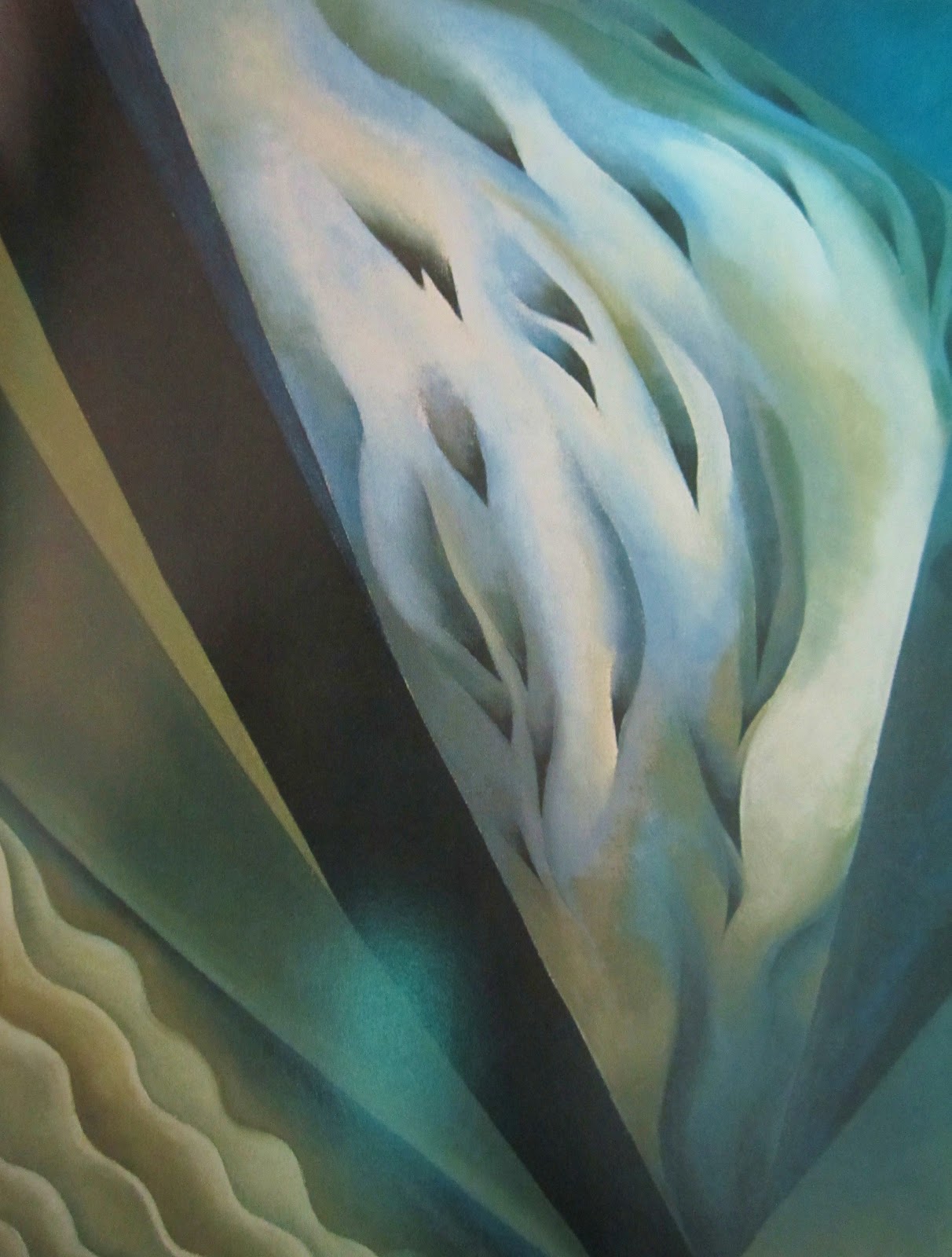
Blue and Green Music, 1919.
Sophia said:
=> I really like this picture because it flows across the page.
=> She captured the smooth motion...it looks like water running over rocks.
=> She never used white in the picture, but added a light blue on top.
=> She used a lot of the cool colors - blue, green, and teal.
=> I like how she could capture one side in pale blue and then she blended it into a different color to make blue, then teal, and black.
=> This is one of my favorite ones because I thought immediately of moving silk almost. It was very pretty.
=> When I see it, it was named appropriately because it flows - like music, water, or how she was feeling one day.
Olivia said:
=> I like the colors - the greens, whites, and blues.
=> I like it because it looks like the ocean.
=> It has a tinge of black in the picture.
=> It's kind of all wavy.
=> It's kind of my favorite picture, but not my favorite one.
=> I like the blacks on the blues.
=> I thought it looked like music because it was kind of wavy.

My Shanty, Lake George, 1922.
Sophia said:
=> The first thing I noticed when I looked at the shanty was that she painted it in a bright white. It stood out against the browns and grays of the picture.
=> When I look into the distance, I see the mountains. It looks almost black. It looks like there's a little bit of dark blue.
=> By the side of the shanty, there's a bush that's a jade-green in color. It looks mysterious.
=> There's a branch that looks like an elephant trunk. IT looks like a trunk spewing a little bit of green mist.
=> I like the way she did the clouds. They're in a darker blue. Farther out, they are wispy.
=> It's not my favorite picture, but not the worst one I've seen.
Olivia said:
=> I like how the tree branches are jetting out. It looks like a snack with an open mouth.
=> I don't really like the color of the shed. It's a brownish-reddish color.
=> I like how she did the clouds - kind of in a wavy pattern. They cover the sky just a hint.
=> I like the blues and greens on the tree and the mountains.
=> I like the colors - how she did the roof of the shed and the open door.
=> The window was square.
=> The shed was a rectangle.
=> There are big and small shrubs around the shed.
=> There are 2 or 3 trees in the picture.

Red Canna, 1924.
Sophia said:
=> I really like this picture and how she blended the colors. One part is vivid red and further down is completely white.
=> I like the purple the best. There's enough darker color to make it look purple, but it almost looks pink.
=> I like the pink because she can blend it in and make it look red.
=> The colors are all warm.
=> I think the main focus is the colors - not the flower - because the lines are softened.
=> The colors she used were red, orange, yellow, pink, purple, and white...all blended together.
Olivia said:
=> I see red...all I see is red. Other pictures have more color.
=> There's yellow in it.
=> There's lot of different shades of colors.
=> Out of all the colors, I think the red stands out the most with yellow and pink.
=> There are no dark colors on the flower.

Radiator Building - Night, NY - 1927
Sophia said:
=> It wasn't like a lot of her other pictures. It was sharp and clear. It was like something you'd see in a children's book.
=> There's a wisp of smoke coming out from one of the buildings. As it gets higher up, it gets thicker.
=> There are the search lights. Like if you'll pull a heist and the search lights come on. When it mingles with the smoke, it turns into a teal color.
=> At the bottom of the building, there are 5, 6, or 7 orb things - like a flashlight. They're strong.
=> On the building, you can see lights on. Half are lit up, and the others aren't so it's pitch black. It gives the impression that it's a very big building and lots of people are in it.
=> Around the Radiator Building there were lots of smaller buildings.
=> There are lots of areas that are pitch black. It's like it's 1:00 in the morning.
Olivia said:
=> I like it because there's a red streak on the edge of the picture...that's cool.
=> I like how in the building you can see people standing by the windows (or the shadows of them).
=> Some of the windows don't have lights, so you can't see the building. If you look carefully, you can see the top of the building.
=> The colors in the pictures are whitish-red, gray, and black. There's a tinge of red or a red stripe, and a little bit of yellow.
=> I like how she used gray for the top of the building. It looks like a real building in New York.
=> There was blue at the top of one building.

Ram's Head, White Hollyhock, Hills, 1935
Sophia said:
=> The picture seemed dark and foreboding.
=> The horns on the ram's head extend out into the dark sky.
=> I like the hills because she did them in sand. It looks like clay.
=> I like the flower. It wasn't intricate. It was simple and nice.
=> The horns were longer than normal ram's horns.
=> The predominant colors were red in the ram's horns.
Olivia said:
=> I like how she did the hills and the clouds.
=> I like how she did the little trees and the flower on the ram's skull.
=> I like how she did the skull because it looked real.
=> The picture had dark colors - gray, dark yellow, and red.
=> The horns were cool. They were sharp.
=> The flower was white and yellow.

Gray Hills, 1942
Sophia said:
=> This isn't one of my favorite pictures. There's not a lot to see.
=> The top of the mountain or hill looks like it has been spray painted and it's not real.
=> She painted a few flowers at the bottom. They were gold-ish yellow in color. There were a few a little higher up. They looked out of place because of all the rock.
=> She used color around the middle of the hill - brown at the bottom, yellowish-orange with a mild red, then white with a little bit of brown and gray.
=> There are big boulders and they're roundish in shape.
Olivia said:
=> I like the top of the mountain - it's kind of all black and there's only a few shrubs growing somewhere below that.
=> I like how she did the different layers of gray, a tinge of red, sand tone, and then black rock.
=> I like how she did the sky. It's all one color.
=> The mountain touches the sky.
=> The flowers are gold - like we have here. They are where the gray rocks end.
=> I think this is my favorite painting because it is so pretty. I really like the rocks and how they look.
=> I like how she did where the mountain starts - they jut out like fingers.
4 comments:
Georia O'Keefe was an amazing artist - I love the Radiator Building - Night, NY piece...I feel like I should be hearing a Big Band in the back ground with lots of brass and enjoying a glass of wine or champagne
Red Canna is my favorite!
It sounds like you're doing a wonderful job of exposing your children to a variety of subjects. I'm inspired! I hope when I homeschool my son, I can do as good a job as you do!
I LOVE Georgia O'Keefe! One of my all-time favorite artists! How lovely that you've introduced your children to her.
Post a Comment