After using such vivid colors last week (pink, orange, yellow, and white), the green and black/dark brown seemed to be such a contrast...at least in terms of creating window stars.
Nonetheless, I tried a trio of patterns to see what these colors looked like together.
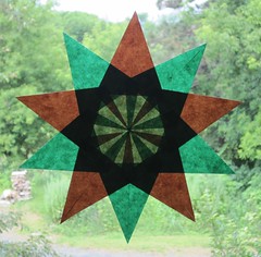
I had two shades of green paper with which to work. The ten-pointed window star below is done in dark green and brown. Initially, I thought it was a rather dark star. Yet, as I look at the three stars I created this week, I think this one is the most balanced, and has a more confident or strong look to it.
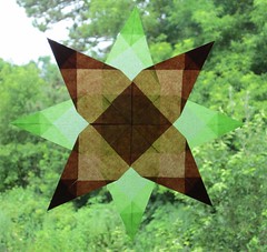
The next star I made looks kind of pale and sickly...doesn't it? Kind of just fades into the background.
Then I wanted a star that tied all the colors together. Came up with a nine-point star:
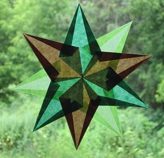
I'm not too crazy about that one either.
So, this is what the trio of stars looks like together this week:
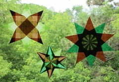
Between last week and this week of the Summer of Color, I definitely like the first week much better. The "rainbow sherbet" stars are much more vibrant than the "mint chocolate chip" stars.
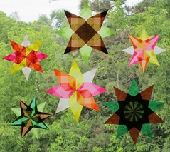
Out of the ones created so far, do you have a color preference (rainbow sherbet or mint chocolate chip)?
What about a favorite pattern? (My favorite pattern out of the six window stars I've done so far as part of Summer of Color is the biggest rainbow sherbet star.)

16 comments:
Hey hun,
IMHO I think your right the first choc chip star looks the best. But when you put all 6 together you can see something rather beautiful emerging. So..... I think that by the end of the 6 weeks its may be a case of everything being bigger than the sum of its parts as they say.
H2H
x x x
loving how they all look together - I prefer the vibrant colours of teh first set and my fav pattern is the 2nd in today's set. Lookign forward to seeing the window fill over the coming weeks
I actually really like the green and brown colour combination - I think because I like nature and natural colours! I think all the stars together look pretty great although I like the first one best by itself.
I really like the first one, but whatI really like is the combination of all of these--they really compliment each other--well done!
ooh I like your entry it's very original take on the challenge.. looks so cute! if you visit my blog, be sure to enter the give-away! everyones welcome x
bonitabonbons.blogspot.com
So pretty... especially as a combination. I, too, like the large rainbow sherbet one, but they are all beautiful. The mint chocolate chip ones have more of a rainy day or autumn feel to them.
They ALL look wonderful together, and I really like the 9 point mint choc chip star!
Sweet....do you leave then up? xxx
These are stunning & beautiful!!! Perfect in the ice cream "flavours for the Sumer of colour!!!!
Lovely! :)
They are ALL so beautiful but if I had to have a favourite this week it's the first one - the balance of colours works really well. I just love them!
Your window stars are beautiful... love the different patterns you create... week one is my fave... only because they are brighter I think... but they do all look lovely together...
Hugs
Jenny x
Your window starts are so sweet!
You are going to have quite a collection at the end! I loved last week but I like this week too. The 2nd one is my fav actually..
The rainbow sherbet are still my favourite but the middle choc mint one is rather stunning as well... that window is going to be glorious by the end of this...xx
LOVE what you did with this weeks colours...Beautiful! What a fab collection you will have at the end of the 6 weeks!
Post a Comment